Improving images for Welcome page
I posted about the first-boot Welcome page here:
https://bkhome.org/news/202205/first-bootup-welcome-page.html
The first image, showing the desktop, with superimposed text, is a problem, as there are three factors that affect how it looks, whether there is support for containers, top-level zram, and language.
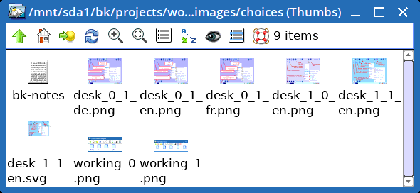
To handle this, in woofQ there is now rootfs-skeleton/usr/share/doc/easy/images/choices, with a selection of images:

The "desk" images are named according to "desk_${EOS_SUPPORT_CONTAINERS}_${EOS_TOP_LEVEL_ZRAM}_${LANG:0:2}.png"
Script '3buildeasydistro' chooses the appropriate images, copies
them up, then deletes the 'choices' folder. If there is no "${LANG:0:2}",
fallback is to use the "en" variant.
Notice the SVG file, to make it easy to create variants in the
future.
Tags: easy
